
Role
UX/UI Interaction Designer
Timeline
2013
TOOLS


In Fall/Winter 2013, Call It Spring undertook a comprehensive refresh of its online presence to align with the brand’s innovative and stylish reputation. The project included updating the website’s visual appearance while maintaining its existing structure, aiming to evolve and adapt to seasonal product marketing.
Key to the project's success was understanding our target users—style-conscious and tech-savvy young adults. Our objective was to create an engaging and seamless online experience that resonated with their preferences and behaviors. Collaborating closely with marketing, product, and development teams ensured the design and functionality met user needs and expectations.
Understanding our target users—young, trend-conscious individuals looking for affordable, stylish footwear—was foundational to our redesign. Our goal was to create an intuitive, visually appealing experience. Leveraging CMS data, user feedback, and click analytics helped us pinpoint strengths, gaps, and improvement areas to boost engagement and sales.
Engaged in cross-functional collaboration with marketing, product, and development teams, we conducted extensive user research to understand the preferences and behaviors of our target demographic.
• Created digital design assets that reflected the outer-space theme and appealed to the 18-25-year-old audience.
• Coordinated the photography direction to maintain a coherent and consistent style across the website.
• Updated the website’s visual appearance by refreshing photography and copy content while maintaining the existing structure
• Aimed to evolve the website to better reflect the brand and adapt to seasonal product marketing.
Designed the blog to express the brand's identity, drawing inspiration from Pinterest. Utilizing a mosaic photo collage grid, we featured photography and blurbs about each post, creating an engaging and visually appealing platform for brand storytelling.


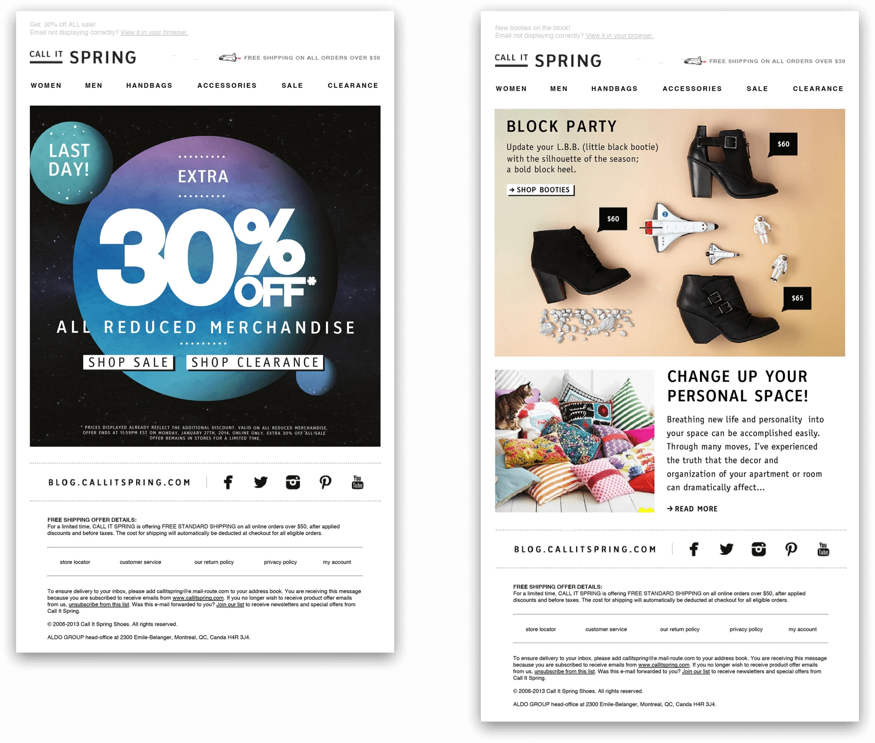
Below are some other examples of the final UI. Updated the website’s visual appearance by refreshing photography and copy content while maintaining the existing structure. Aimed to evolve the website to better reflect the brand and adapt to seasonal product marketing. The final UI showcased a seamless blend of the outer-space theme with user-centric design elements. High-quality imagery, consistent styling, and responsive layouts ensured a cohesive and engaging user experience across the website, newsletters, and blog.

Have a project
Let my expertise as a seasoned product designer transform your ideas into standout designs. I specialize in bringing innovation and functionality to the table, ensuring your project surpasses expectations.